Performance
5 min read
Optimisation is editing, not stripping
Performance work has a reputation for making sites worse: flatter, plainer, less characterful. That happens when optimisation is treated as deletion. The better approach is editing, keeping the moments that carry the brand and paying for them by removing the weight nobody notices.
In practice the wins repeat across almost every project. Oversized imagery, fonts loaded but never used, scripts inherited from a campaign that ended two years ago, and animation applied to things that were already clear. None of those are creative decisions worth defending.
Measure what people feel
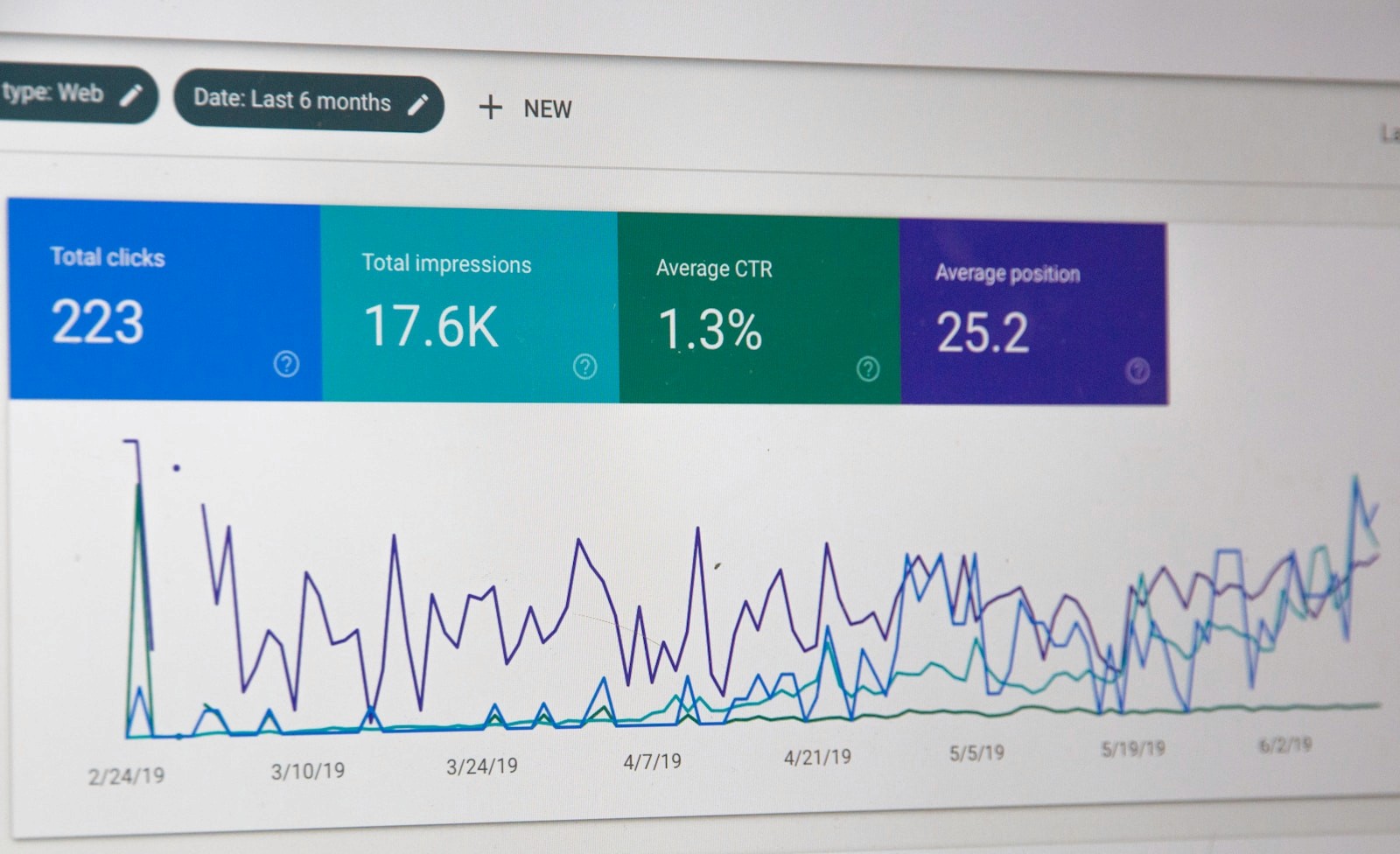
Scores are useful, but the honest test is how quickly the first meaningful thing appears and whether the page stays stable while it loads. Optimise for that experience and the numbers usually follow on their own.

The usual suspects
Performance problems are rarely mysterious. On most sites we audit, the same handful of decisions account for nearly all of the weight, and none of them are the things that give the site its character.
Images exported at print size and scaled down in the browser.
Four font weights loaded, two of them never used on the page.
Tracking scripts inherited from a campaign that finished two years ago.
Animation applied to elements that were perfectly clear standing still.
Removing those costs nothing creatively. It also buys you the budget to keep the one big image, the considered type or the piece of motion that people actually remember.
Optimisation is editing. Keep what carries the brand, and pay for it by removing the weight nobody notices.
Protect the moments worth keeping
Decide up front which two or three moments carry the site: the opening image, a signature transition, a piece of illustration. Everything else is negotiable. Once that list exists, performance work stops feeling like a fight, because the conversation is about the negotiable parts rather than the identity.
Order matters more than totals
A page that shows its heading immediately and settles quickly feels fast even when the total download is unremarkable. A page that loads the same amount in the wrong order, shifting as fonts and images arrive, feels broken. Sequence is a design decision, not a technical afterthought.
Test the way people actually visit
Check the site on a mid-range phone on mobile data, not a desktop on office broadband. Around Chester and the wider North West that is how a large share of visitors arrive, often somewhere with patchy signal, and it changes which compromises are worth making.
Scores are a useful prompt, but the honest test is simpler: how quickly does the first meaningful thing appear, and does the page stay still while the rest arrives. Optimise for that and the numbers tend to follow without anyone gutting the design.