Brand
7 min read
A logo is the smallest part of it
Almost every conversation about brand identity starts with the logo, and almost none of the value lives there. A logo is a signature. It confirms who sent something. What actually makes a business recognisable is the accumulation of everything around it: the typeface, the spacing, the tone of the writing, the way photography is cropped, the words chosen for a price increase.
Put differently, an identity is a set of decisions that have already been made so that nobody has to make them again badly. That is why two businesses can use almost identical logos and still feel completely different. The logo was never doing the work.
The parts that carry the weight
A typeface hierarchy, with a clear rule for what a headline, a subheading and body copy look like in every context.
A colour system that says which colour dominates, which supports, and which is reserved for emphasis so it keeps its power.
A photographic or illustrative direction, described specifically enough that somebody else could brief it.
A written voice, including how the business sounds when the news is bad.
Spacing and layout habits, which are invisible individually and unmistakable in aggregate.
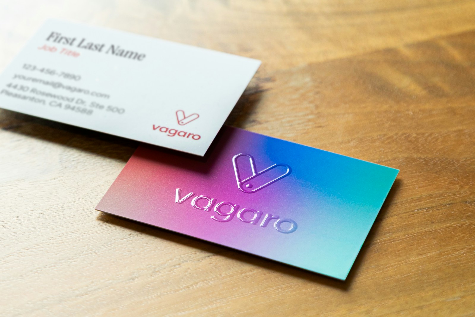
Why it matters commercially, not just aesthetically
A coherent identity lowers the cost of every future piece of communication. When the decisions are settled, a proposal cover takes twenty minutes instead of an afternoon of debate. A new hire produces something usable in their first week. An agency briefed on a campaign does not need to invent a look, because one already exists and is documented.
It also shortens the distance between seeing something and recognising who made it. That recognition is the only reason repeated marketing spend compounds. Without it, every campaign starts from zero and you are effectively renting attention rather than accumulating it.
An identity is a set of decisions already made, so nobody has to make them again badly.
What we produce, in practice
A positioning statement in plain language, agreed by the people who will have to repeat it.
The core identity: wordmark, monogram or symbol, in every format the business genuinely needs.
A working type and colour system, tested against real content rather than a perfect example.
Applied mock-ups so the identity is seen in situ before anyone commits: signage, vehicle, packaging, deck, invoice.
Guidance written for the person who was not in the room, with examples rather than rules.

Where it usually goes wrong
The most common failure is an identity designed against imaginary content. A wordmark that only sits comfortably on a white square, a colour that fails on a phone in daylight, a typeface with no bold weight for the one place a bold weight is needed. All of those are solvable in a fortnight of care and expensive to solve in year two.
The second most common failure is an identity nobody was taught to use. We do the handover in person for exactly that reason: a short session where the people producing the day-to-day work make something with it while we are still in the room.